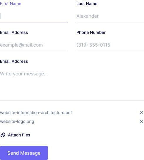
Contact Form
A contact form is usually displayed on a webpage with an input field for each piece of information required by the website, such as name, email address, subject, and message. This contact form is ready to use with FormBold and available in Tailwind CSS and Plain HTML.
Preview

<div class="main-wrapper"> <div class="form-wrapper"> <form action="https://formbold.com/s/YOUR_KEY" method="POST"> <div class="mb-5"> <label for="name" class="form-label"> Full Name </label> <input type="text" name="name" id="name" placeholder="Full Name" class="form-input" /> </div>
<div class="mb-5"> <label for="email" class="form-label"> Email Address </label> <input type="email" name="email" id="email" placeholder="Enter your email" class="form-input" /> </div>
<div class="mb-5"> <label for="subject" class="form-label"> Subject </label> <input type="text" name="subject" id="subject" placeholder="Enter your subject" class="form-input" /> </div>
<div class="mb-5"> <label for="message" class="form-label"> Message </label> <textarea rows="6" name="message" id="message" placeholder="Type your message" class="form-input" ></textarea> </div>
<div> <button class="btn">Submit</button> </div> </form> </div></div><style> * { margin: 0; padding: 0; box-sizing: border-box; } body { font-family: "Inter", sans-serif; } .mb-5 { margin-bottom: 20px; } .pt-3 { padding-top: 12px; } .main-wrapper { display: flex; align-items: center; justify-content: center; padding: 48px; }
.form-wrapper { margin: 0 auto; max-width: 550px; width: 100%; background: white; } .form-label { display: block; font-weight: 500; font-size: 16px; color: #07074d; margin-bottom: 12px; } .form-label-2 { font-weight: 600; font-size: 20px; margin-bottom: 20px; }
.form-input { width: 100%; padding: 12px 24px; border-radius: 6px; border: 1px solid #e0e0e0; background: white; font-weight: 500; font-size: 16px; color: #6b7280; outline: none; resize: none; } .form-input:focus { border-color: #6a64f1; box-shadow: 0px 3px 8px rgba(0, 0, 0, 0.05); }
.btn { text-align: center; font-size: 16px; border-radius: 6px; padding: 14px 32px; border: none; font-weight: 600; background-color: #6a64f1; color: white; cursor: pointer; } .btn:hover { box-shadow: 0px 3px 8px rgba(0, 0, 0, 0.05); }
.-mx-3 { margin-left: -12px; margin-right: -12px; } .px-3 { padding-left: 12px; padding-right: 12px; } .flex { display: flex; } .flex-wrap { flex-wrap: wrap; } .w-full { width: 100%; } @media (min-width: 540px) { .sm\:w-half { width: 50%; } }</style>